This page explains how to edit building blocks and the options for using some of the basic and intermediate features of forms4health, such as adding text and number fields, adding data field controls and using reference data to further customise the response options available in your building blocks. What you can find on this page:
For more information on advanced features of building blocks, go to the advanced features of forms4health page.
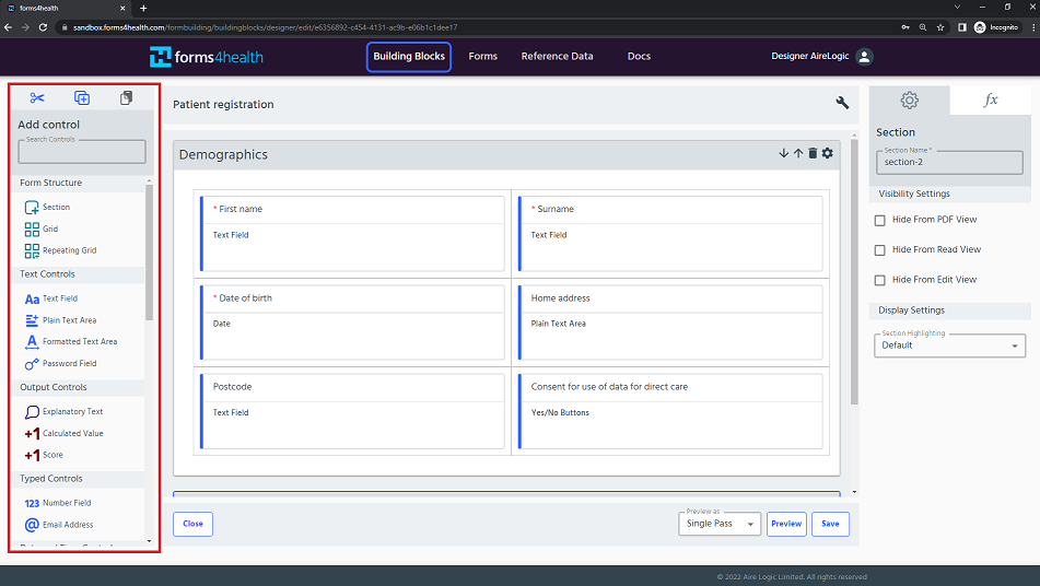
Building block menu
The left hand menu in the Building Block Designer contains a range of options for customising building blocks. These data field (or control) options are used to specify the format and method of data collected within a building block.
Functions: what would you like to do?
- Add explanatory text to explain a building block, a section or a data item and help users understand what to do
- Get users to select one option from a range of options
- Get users to select-multiple options from a range of options
- Record a date or time
- Add images or video into a data field
- Highlight data fields
- Use reference data
- Add a response hint to make a suggestion to users about what data to input
- Preview a building block
Note: all of the screenshots below show the Building Block Designer. When you’ve found what you’re looking for, and you’re ready to see what a fully customised form looks like, go to the preview and test forms page to see a preview.
Add explanatory text
You might want to add a block of text to explain to a user how to approach completing your form or building block. It’s best to keep this separate from your data fields and you can use the Explanatory Text option from the menu to input and edit your text.
Use for: adding text that is not part of your data item(s)
For example:
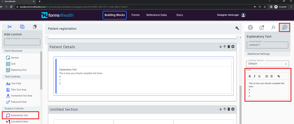
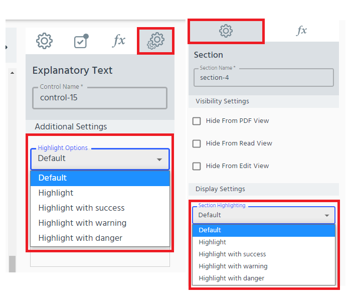
After you have inserted the explanatory text control into the building block, click on the cog icon at the right hand side of the screen to configure its additional settings. Enter the desired explanatory text in the “text” field. You also have the option to select one of the highlight choices.
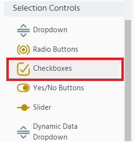
Single selection controls
If you want a user to select one option from a range of options, there are a number of ways that you can present the available options to the user. Each one is explained below, or see the overview table.
Click to skip to:
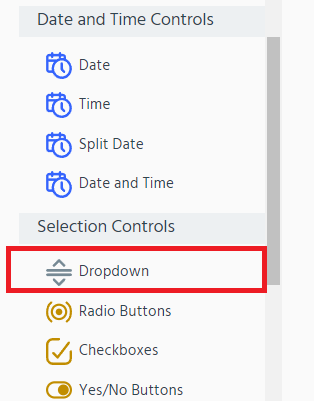
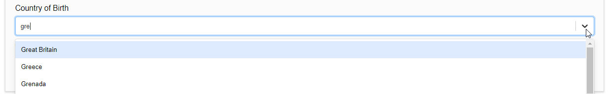
Dropdown
The Dropdown control allows you to create a constrained list view of options that users can choose from. This option can conserve on-screen space within your building block or form and can be useful when the range of options are familiar to the user.
Use for: small and medium-sized option lists (e.g. up to 20 available options).
- Select Dropdown from the left hand Building Block Menu.
- Add a relevant label to describe the list or range of options (e.g. Patient’s current GP Practice).
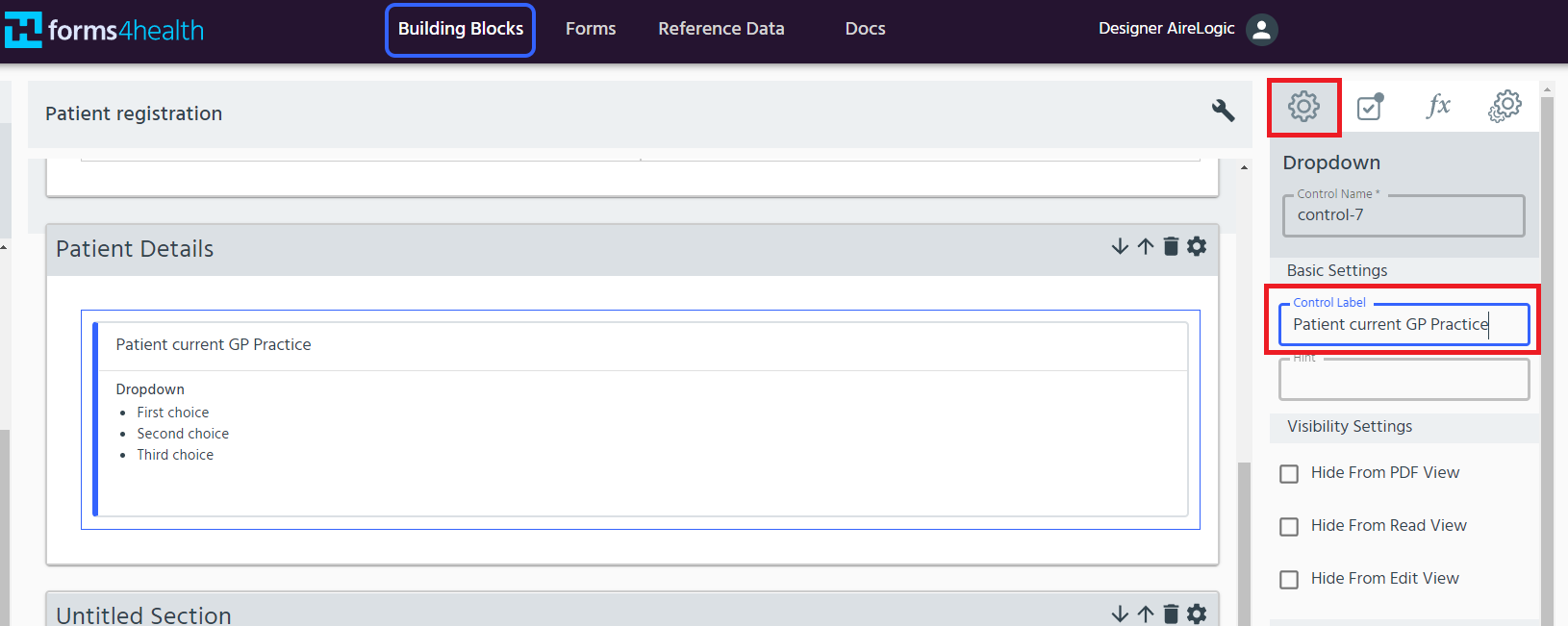
Then click the Cogs icon on the right hand side of the data item to edit the Dropdown Menu options.
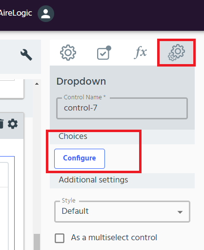
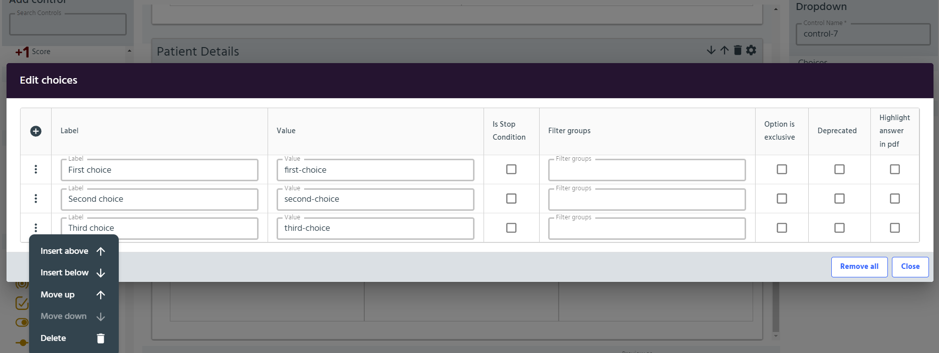
- The default list contains three labels. Edit the labels to describe the available options. Click the + sign at the top left of the table to add another option at the end of the list or click the dots _icon on the left hand side to get more options. The _arrows can also be used to move an option up or down in the list or remove any unwanted labels. Ensure that each labelled option has a different numeric value in the value column to ensure selected options are coded appropriately. Once you have completed editing, click Close.
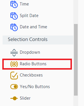
Radio Buttons
Radio buttons allow users to quickly choose one option (text or number) from a small range of predefined mutually exclusive options, whilst having the advantages of providing a visual cue to users about the option they have selected and emphasising the other available options.
Use for: a small list (e.g. no more than 5 options) or a small number range (<10 numbers).
- Select Radio Buttons from the left hand Building Block Menu.
- Add a relevant label to describe the range of options (e.g. In an average week, how often does the patient forget to take their preventative medication?).
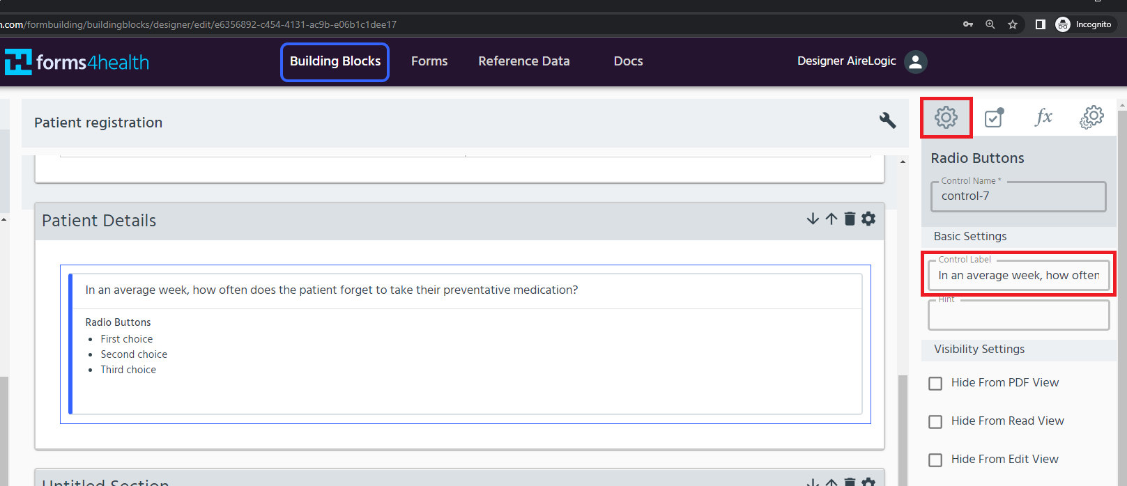
Then click the _Cogs _icon on the right hand side of the data item to edit the Radio button options.
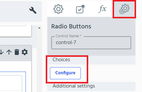
- The default list contains three labels. Edit the labels to describe the available options. Click the + sign at the top left of the table to add another option at the end of the list or click the dots _icon on the left hand side to get more options. The _arrows can also be used to move an option up or down in the list or remove any unwanted labels. Ensure that each labelled option has a different numeric value in the value column to ensure selected options are coded appropriately. Once you have completed editing, click Close.
Yes/No answer
There is a pre-configured yes/no radio button data field in the left hand Building Block Menu under Selection Controls.
Use for: quickly adding yes/no radio buttons to your building block.
Select Buttons
Select buttons are an alternative way to present a small list (text or numeric) where you want each option to be visible within a clickable button.
For example:
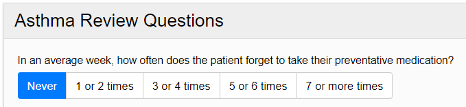
Use for: a small list (e.g. no more than 5 options) or a small number range (<10 numbers).
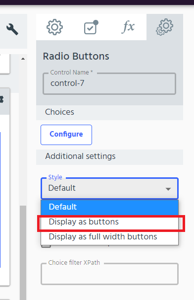
- Follow steps 1-3 to edit radio buttons, as above. Then, click the Additional control settings (cogs) icon.
- Under Additional sSettings change the Style dropdown option to ‘Display as Buttons’. Click Apply.
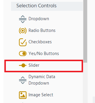
Slider
This is a simple way to get a user to select a single numeric value from a small or large number range using a dynamic slider.
Use for: small (<10 numbers) or large (>10 numbers) number ranges.
For example:
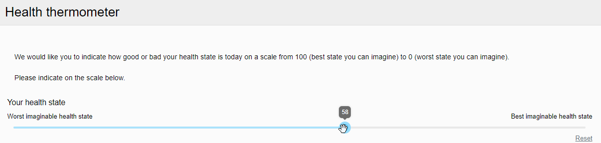
- Select Slider from the left hand Building Block Menu.
- Add a relevant label to explain the scale to the user (as well as explanatory text, if required).
- Click the Additional Settings tab to edit the:
- Lower value text with associated Minimum value
- Upper value text with associated Maximum value
- Show value as tooltip option - select ‘Yes’ to display the user-selected value on the slider (as in the preview above), or
- Show value option to display the user-selected value below the slider.
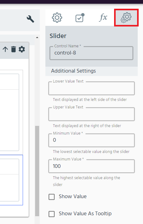
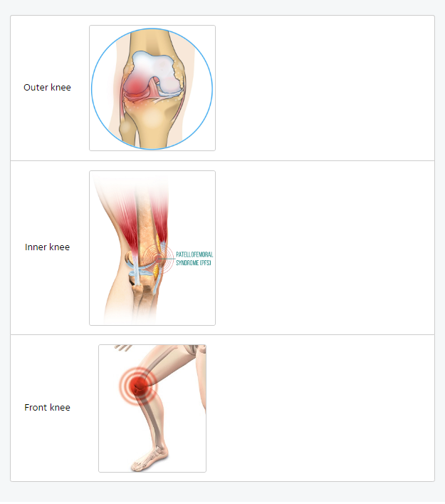
Image Select
Image Select allows an image to be associated with each available option and lets the user select from the images presented.
Use for: small list (<5 options) or small number range (<10 numbers) where an image is required to present each option.
For example:
- Select Image Select from the left hand Building Block Menu.
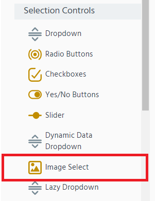
- Add a relevant label to describe the image list or range of options (e.g. Left knee pain location).
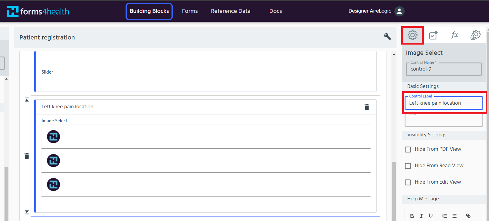
- The default list contains three labels (see step 4 to add or delete labels). Edit the labels to describe the available options. Next, select an associated image for each label by clicking on the current image for the relevant label under the Image column.
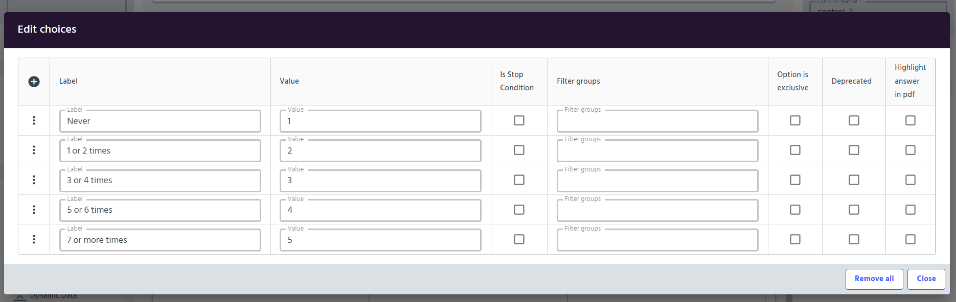
- Click the + sign at the top left of the table to add another option at the end of the list or click the dots _icon on the left hand side to get more options. The _arrows can also be used to move an option up or down in the list or remove any unwanted labels. Ensure that each labelled option has a different numeric value in the value column to ensure selected options are coded appropriately.
- Once you have completed editing, click Close.
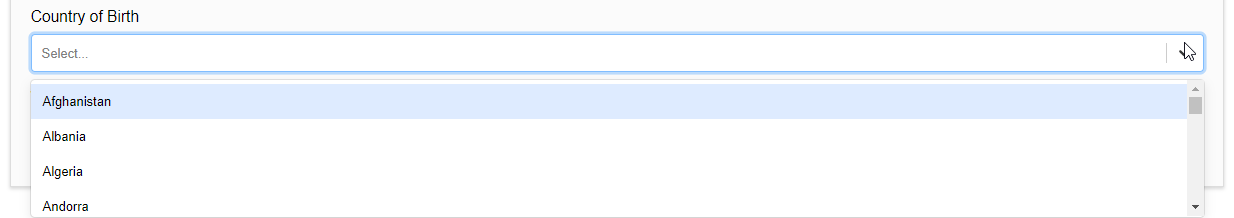
Dynamic Data Dropdown
Dynamic Data Dropdown can support form users to select a response from medium and large lists, where the number of available options could reach up to one hundred. When a form user begins typing in their selection, the dynamic list presents a narrower range of relevant options.
In addition, by using reference data, large lists and shared lists can be populated and maintained easily without the need for manually inputting all of the possible options.
For example:
Use for: medium lists (6-20 options) or large lists (21-100 options), or when using shared reference data with fewer than 100 fields
Lazy Dropdown
Use for: large lists (21-100 options) or extra large lists (>100 options), or when using shared reference data with more than 100 fields
Overview of recommended forms4health single selection controls
The table below shows common data types that will be available to users within a form (left hand column) and the recommended control to best construct and present these data types within a building block.
| COMMON DATA TYPES / MENU OPTION | DROPDOWN MENU | RADIO BUTTONS | SELECT BUTTONS | SLIDER | IMAGE SELECT | DYNAMIC DATA DROPDOWN | LAZY DROPDOWN |
| Small list (<6 options) | ✔ | ✔ | ✔ | ✘ | ✔ | ?* | ✘ |
| Medium list (6-20 options) | ✔ | ✘ | ✘ | ✘ | ✘ | ✔ | ✘ |
| Large list (21-100 options) | ✘ | ✘ | ✘ | ✘ | ✘ | ✔ | ✔ |
| Extra large list (>100 options) | ✘ | ✘ | ✘ | ✘ | ✘ | ✘ | ✔ |
| Image | ✘ | ✘ | ✘ | ✘ | ✔ | ✘ | ✘ |
| Small number range (<10 numbers) | ✘ | ✔ | ✔ | ✔ | ✔ | ✘ | ✘ |
| Large number range (>10 numbers) | ✘ | ✘ | ✘ | ✔ | ✘ | ✘ | ✘ |
| Shared reference data (<100 fields) | ✘ | ✘ | ✘ | ✘ | ✘ | ✔ | ✘ |
| Shared reference data (>100 fields) | ✘ | ✘ | ✘ | ✘ | ✘ | ✘ | ✔ |
*Note on Dynamic Data Dropdown:
Multiple selection controls
Numerous options from the Building Block Menu allow the use of multi-select and where required let the user select more than one option from a range of options.
Checkboxes are pre-configured for multi-select. Find out more below.
Four of the other Building Block Menu options allow multi-select to be added in the settings:
- Radio Buttons
- Select Buttons
- Dropdown Menu
- Dynamic Data Dropdown
Add multi-select
Use for: adding the multi-select control to one of the following data field types from the Building Block Menu - Radio Buttons, Select Buttons, Dropdown Menu or Dynamic Data Dropdown. For example:

- Choose radio buttons or another compatible selection from the left hand Building Block Menu, click the Control Settings (cog) icon to open the settings menu. Under Additional Settings click to place a tick in the As a mutli-select control option.
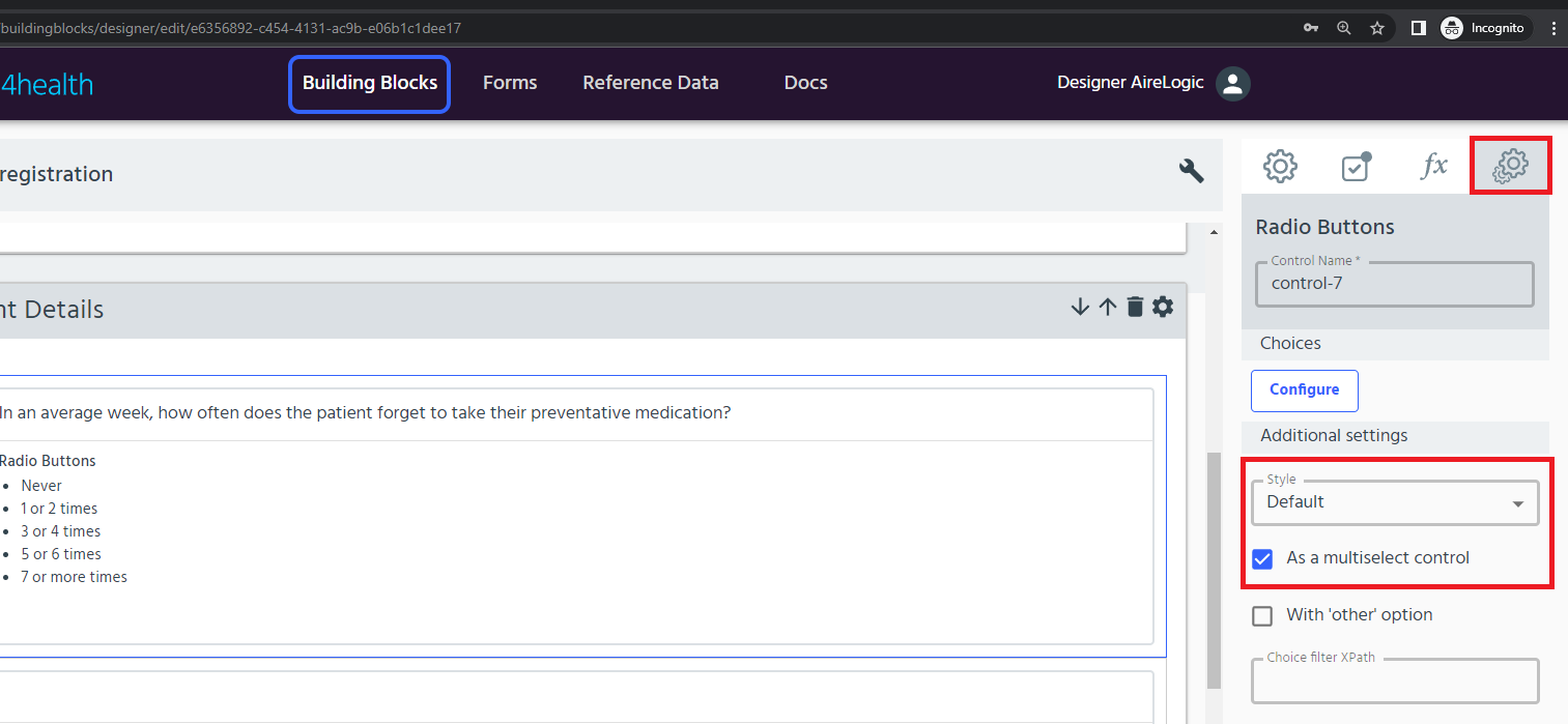
- Use the Control Appearance feature to toggle between Radio Buttons and Dropdown Menu. Ensure that you select a compatible option from the Style dropdown.
- Radio Buttons + Default (Style) will default to showing Checkboxes
- Radio Buttons + Display as buttons (Style) will show Select Buttons
- Dropdown Menu + Default (Style) will show a dropdown
- When you have finished editing the basic settings, click Apply.
Find out more about customising Radio Buttons, Select Buttons, Dropdown Menu and Dynamic Data Dropdown in the Select one option section above.
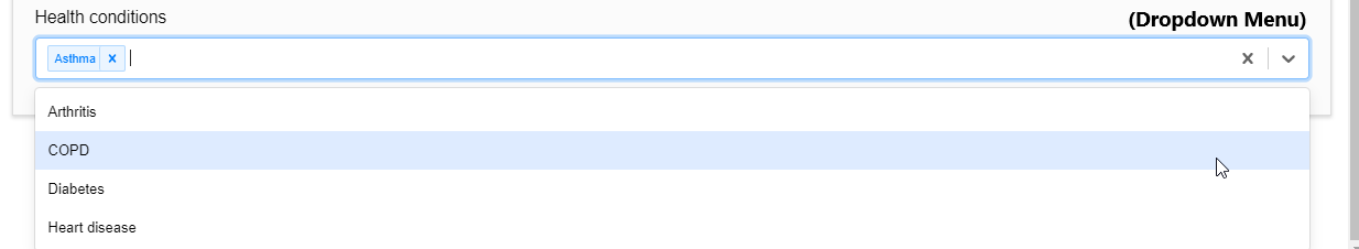
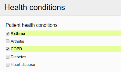
Checkboxes
Checkboxes are preconfigured to support multi-select. Use the checkbox option to allow users to select more than one option from a range of avalable options using response boxes that can be ticked (selected) and unticked (unselected) by click or touch.
For example:
Use for: allowing selection of more than one option from a small-large list. If you want to use reference data to populate the list of options, see more under use reference data.
- Select Checkboxes from the Building Block Menu
- Add a relevant label to describe the list or range of options (e.g. patient health conditions).
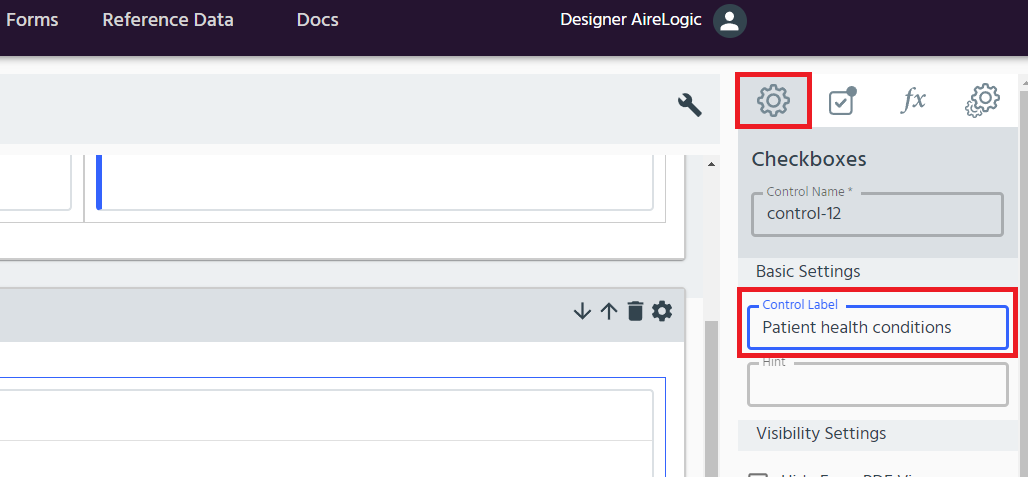
Then click the _Cogs _icon on the right hand side of the data item to edit the checkboxes options.
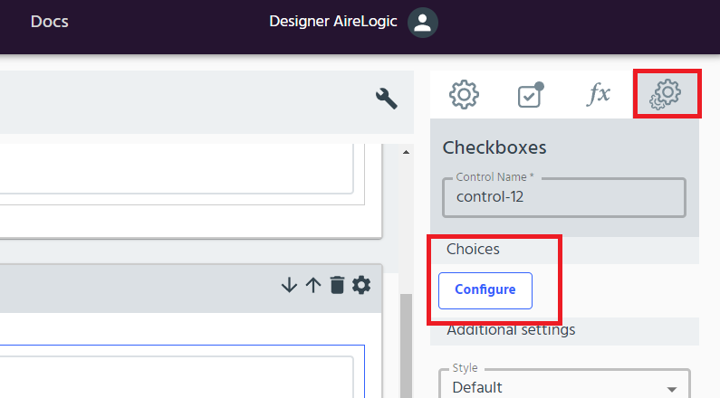
- The default list contains three labels (see step 4 to add or delete labels). Edit the labels to describe the available options.
- Click the + sign at the top left of the table to add another option at the end of the list or click the dots _icon on the left hand side to get more options. The _arrows can also be used to move an option up or down in the list or remove any unwanted labels. Ensure that each labelled option has a different numeric value in the value column to ensure selected options are coded appropriately.
- Once you have completed editing, click Apply.
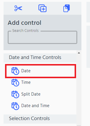
Record a date or time
The date and time Building Block Menu options can be used to capture key date and time information in a suitable format.
Use for: capturing date or time information from form users
Record date
There are two options for capturing a date within a building block: Date or Split Date.
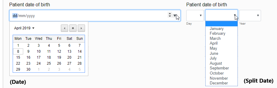
- Select Date or Split Date option from the Building Block Menu
- The date-input format will be configured for the data field. Just add a label (e.g. patient date of birth).
Record time
Time can be recorded in hours and minutes (in 24-hour clock). The user can input time using keystrokes or the scrolling arrows at the side of the time field.
For example:
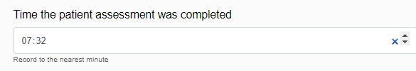
- Select the Time option from the Building Block Menu
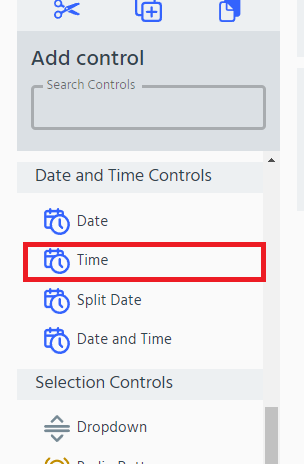
- The time-input format will be configured for the data field. Just add a label (e.g. time the patient assessment was completed).
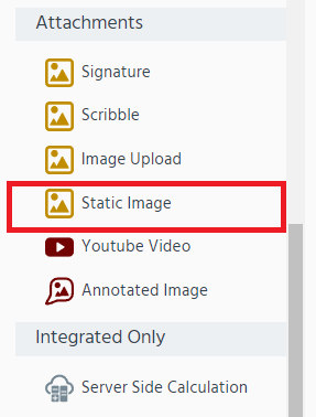
Add images and video
In the Building Block Designer it’s easy to use images and video (attachments) to support your data fields, including using images to support the data or options displayed and even requesting images from the form user.
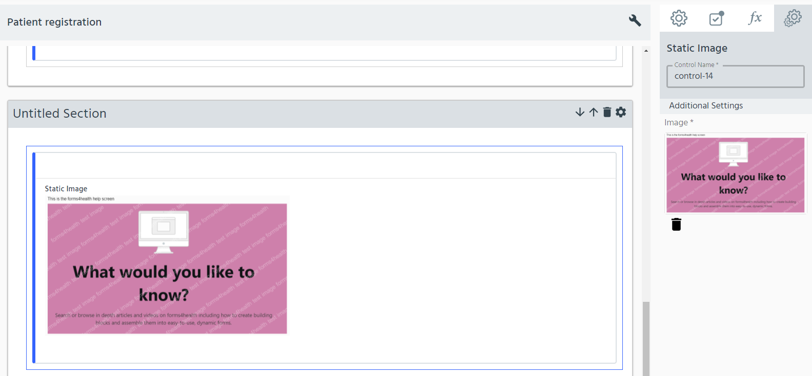
Static Image
Static images can be added to show the user an image that will help them to complete the data fields within a building block.
Use for: providing context for a data field using an image.
For example:
- Select the Static Image option from the Building Block Menu.
- Go on Additional settings and click Choose File and choose your image file from your local directory
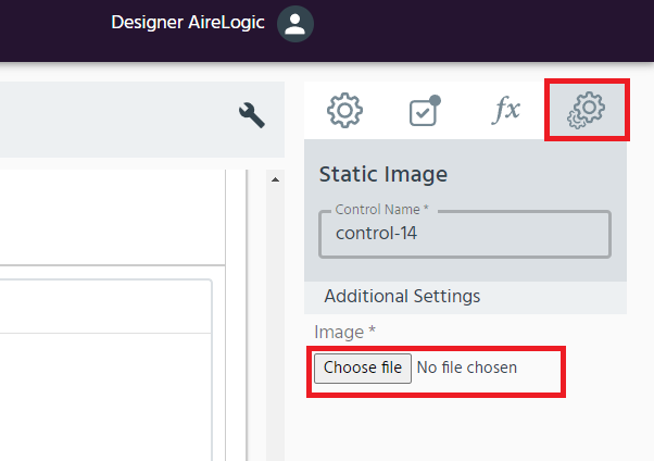
- The image will be uploaded to the Building Block Designer. Add a label to provide context for the image. If you want to delete the image click the red cross and choose a new image.
Using images as selectable options
To find out more about using images to display the available options see Image Select above.
Image upload
You might want to ask a form user to provide some images within the form, to support the data you collect. You can do this using Image Upload.
Use for: asking users to upload images to a form
For example:
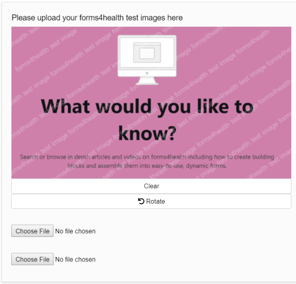
- Select the Image Upload option from the Building Block Menu.
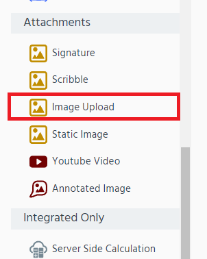
- The image upload format will be configured for the data field. Just add a label (e.g. please upload your forms4health images here). Users can choose files to upload from their file directory - it will open automatically when they click Choose File.
Request Signature
You can ask users to provide a signature within a form as a method of written consent or confirmation for the information they have provided.
Use for: asking users to input a ‘live’ signature on a form
For example:
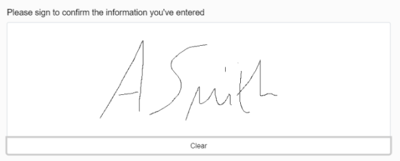
- Select the Signature option from the Building Block Menu.
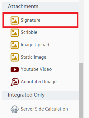
- The signature format will be configured for the data field. Just add a label (e.g. please sign here).
Use reference data
Reference data can be used to populate data fields from an editable dataset that can be stored within the Forms Designer. It is useful for datasets where there are many, many options to choose from and where there may be a need to regularly update the available options. Reference data is useful in these scenarios, as it allows multiple data fields or building blocks to be populated from one data source instead of relying on manual inputting or maintenance across multiple data fields.
Highlight data fields
Some information, data fields, sections or calculated outputs may be useful to emphasise to form users so that they can more easily and effectively provide the required information or understand the form better. Highlighting provides a way of presenting information with colours (blue, yellow and red) to make it more prominent.
Use for: emphasising explanatory text, sections, or data fields.
For example:
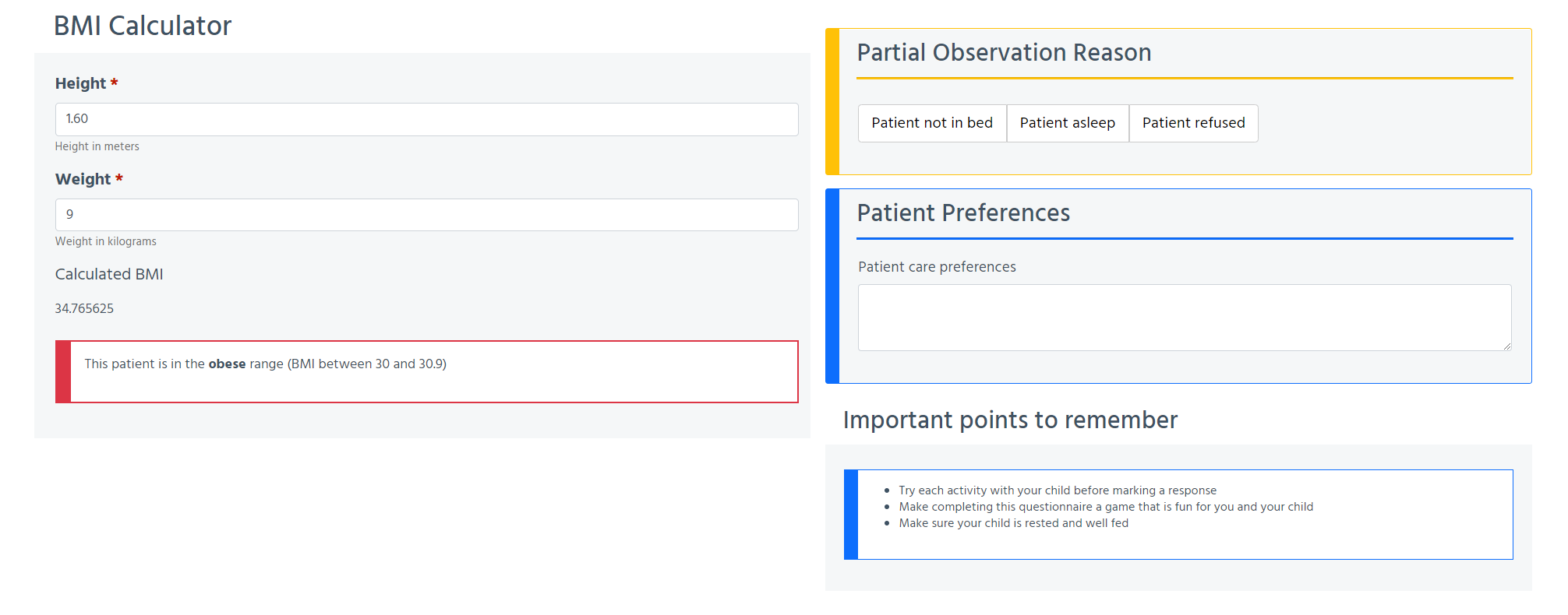
- Highlighting can be achieved at the section level or on the Explanatory Text control. First, click the Additional Control Settings (cogs) icon for the section (i.e. Section Settings) or for the individual data field (i.e. Control Settings) to select the element you want to highlight.
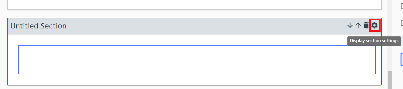
- In the settings menu selected, on the Basic Settings tab, use the section highlight dropdown to choose:
- highlight (displays default blue highlighting)
- warning (displays yellow highlighting)
- danger (displays red highlighting)
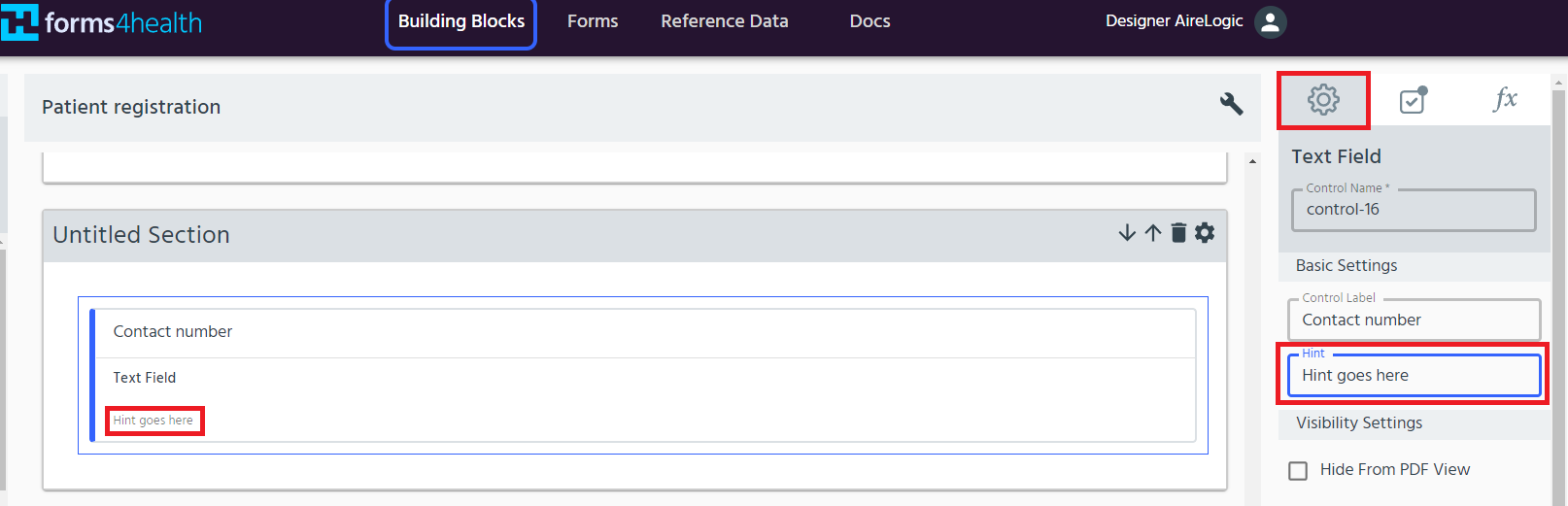
Add a response hint
You may want to provide some additional text around your data field as a hint for the user, either explain why a response is required, help the user respond or let them know how the data collected will be used.
For example:
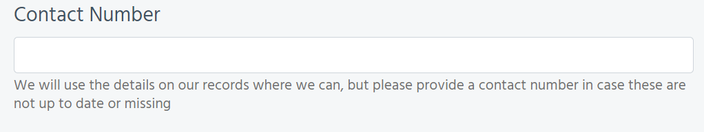
Use for: additional text underneath the data field to instruct the user how best to respond or provide an explanation of the data field to encourage them to respond.
- Under the data field control settings, edit the _hint _ to add a text hint.