This page explains how to add control settings that control the ways in which a user can respond to each data field. For example, you may want to prevent a user from continuing through or submitting a form unless specified data fields have been completed or you may want to allow users to offer an alternative (‘other’) response to the range of response options you’ve provided.
What you can find on this page:
- Required (mandatory) field
- Validation alerts
- With ‘other’ option
- Hide from view
- Add help messages
- Add formulas
Required (mandatory) field
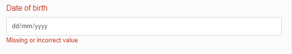
If you want to ensure that a user provides a response to a data field, you can set validation settings to make a field required or mandatory to complete.
For example:
Use for: making a data field required to proceed to the next step (building block, section or page) in a form.
- Click the Validation Settings icon to open the validation settings options.
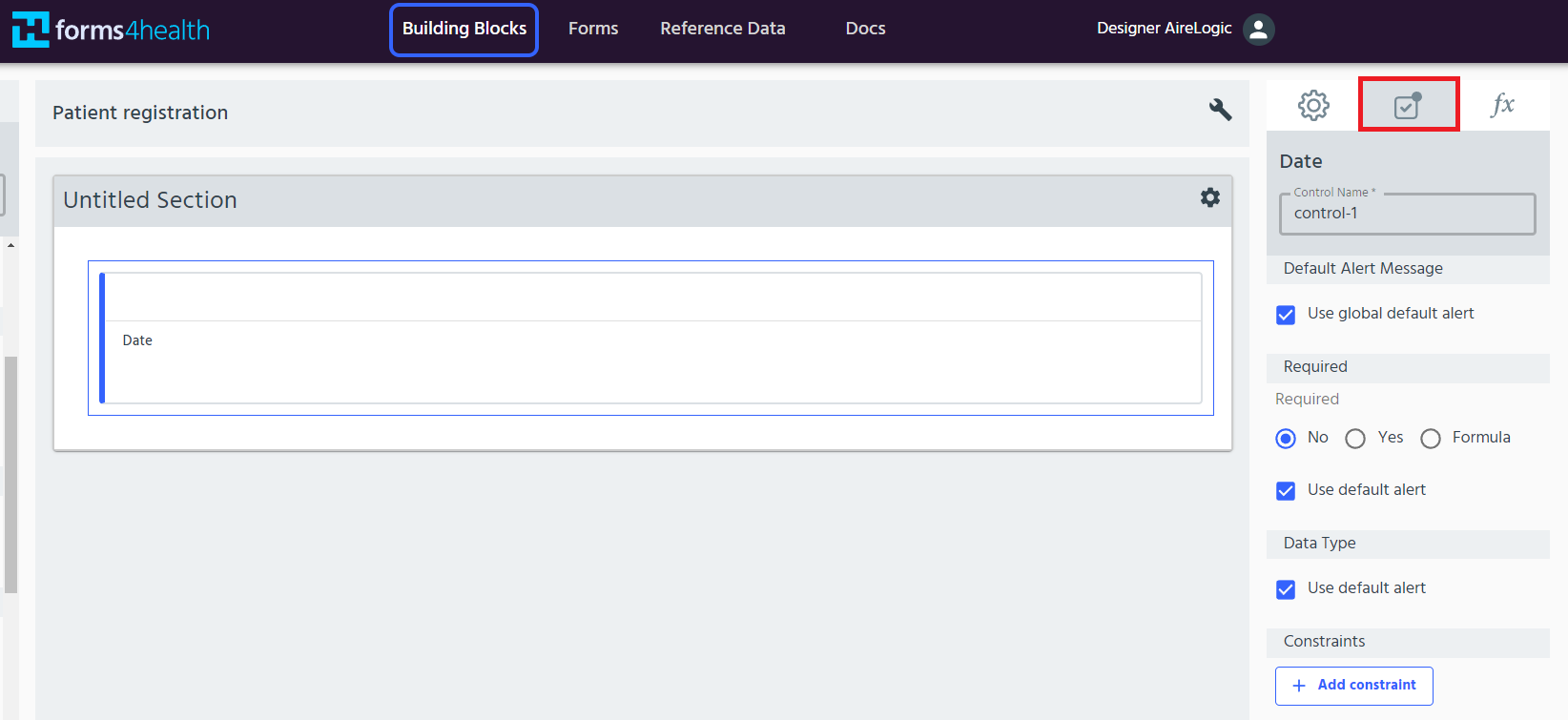
- Change the Required radio button to ‘Yes’ (i.e. Required = Yes).
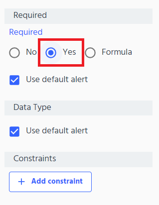
- The data type (e.g. data type = date) will be automatically customised based on the data field type selected from the Building Block Menu (i.e. date for date fields, or string for text fields). The default alert message is ‘Missing or incorrect value’. If you want to customise the alert message, see the next section.
Validation alerts
Validation alerts can be used to display messages to users to let them know that they have not met the rules or requirements built into a form.
Use for: customising alerts to tell the user that information is required or missing, show a warning, or provide information
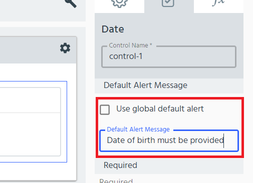
- Click the Validation Settings icon to open the settings options.
- On the Validation Settings tab, uncheck the ‘Use global default alert message’ option and enter your custom message in the ‘Default alert message’ text box. This alert message will be applied to the required field.
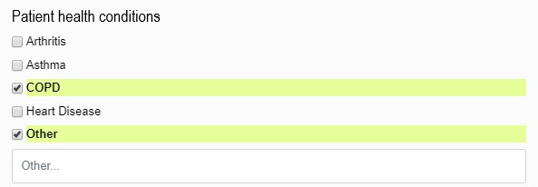
With ‘other’ option
If you want to offer users an opportunity to add their own ‘other’ response instead of or in addition to the predefined responses in the form, use the ‘with ‘other’ option’. This feature can be used for any selection based controls e.g. radio buttons, select buttons, dropdown menu or checkboxes.
Use for: allowing users to add an alternative response option using a blank ‘other’ field.
For example:
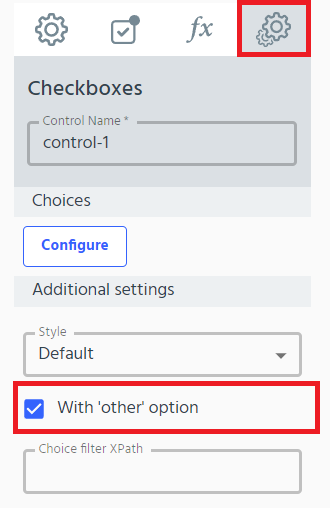
- Click the Control Settings (cog) icon to open the settings options.
- In the Additional Settings tab, click the ‘with ‘other’ option’. You can also configure the ‘Multiselect’ (select multiple) option here.
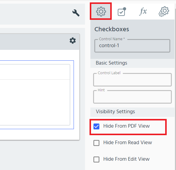
Hide from view
This feature removes selected data fields from read, edit and PDF views in your form. It can be applied to any type of data field.
Use for: removing data fields from different form editor and form user views.
- Click on the control to open the settings options.
- In the Basic Settings tab, there are three ‘Hide from view’ options: Hide From PDF View, Hide From Read and PDF View and Hide From Edit View. Use the checkboxes to select your preference.
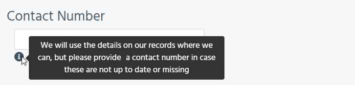
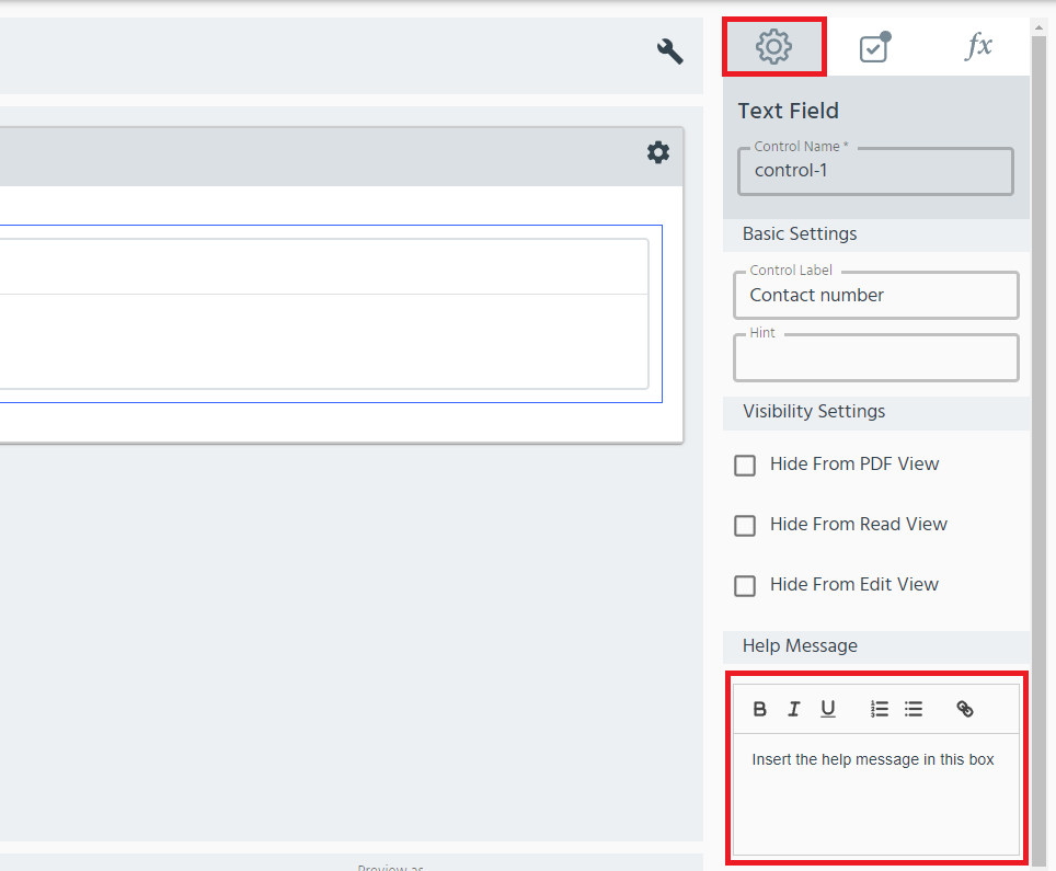
Add help messages
Help messages can be used to provide additional information for form users to help them respond.
Use for: providing in-form help and support information for form users.
For example:
- Click on the control to open the settings options.
- Under the Help Message tab, customise the help information in the text box.
Add formulas
See more about the advanced features of forms4health (XPath) on the Advanced Topics page.
